Design – the unsung hero of advertising.
Good design is the unsung hero of the creative advertisements we encounter every day. It might be the creative idea that steals the glory, wins the awards and is recalled years down the line, but it’s the solid foundation of design that gives it the platform to shine.
Advertisements, whether online, broadcast or printed media are often the most visible face of your business. When they work well they can increase awareness and drive sales. But this visibility comes with a responsibility. It’s easy to be tripped up and make some simple mistakes that can have a detrimental impact on the performance of the campaign and importantly, the reputation of your brand. Today, anyone can easily create advertisements for their business and push them out to the world on several platforms. However, it’s even easier to make them look like they were created in ten seconds without any forethought or obvious design considerations.
So, what elements of design should be taken into account when creating that all-important messaging? These are a few pointers from EBY, based on our experience of creating adverts for the last twenty years.
The basics
It’s not hard to spot ads that have been created by a member of the sales team who last used Photoshop while they were at college. Consume any B2B media and these are not only common, but very obvious. There are plenty of tell-tale signs. They’ll have no margins, use pixelated logos, stretched pictures, have watermarked stock imagery and the alignment of elements will be all over the place. Some of this will be picked up by media owners who will advise the customer; however, as self-serve platforms become common and any business can run ads on social media, more and more of these advertising disasters will appear.
These fundamental design elements are the simplest to fix and get right in any ad, but if the simple conventions aren’t followed, your brand will suffer as the finished product looks unprofessional and amateurish.
Layout and flow
User Experience (UX) for websites has developed into a science of its own, but in reality, it’s nothing new. Understanding how people consume information has always created the message flow for any form of communication. Good design leads the consumer through the content, building the levels of information it needs to convey at each stage.

Here’s an example, a bad one. Where do you start? What message is it trying to convey? There’s enough content to make five or six ads, which would have greater impact.
The ideal structure is based on four points, and if you follow them in creating the hierarchy of a print ad, then you won’t go far wrong in communicating your message in a straightforward manner:
- Headline
- Sub-head
- Body copy
- Call to action
For digital ads, you are relying on even less structure, just a headline and CTA, although options such as GIFs and carousels allow for more information to be communicated.
As with most forms of marketing, less is more when communicating the message. Having a clear flow, with limited copy, will always be more memorable than cramming an ad full of information. Focus on one message in the ad where possible too.
Brand elements
At a minimum, every brand should have a style sheet outlining what design elements should be used when creating ads. A simple colour palette, an agreed typeface and positioning guidance for the logo should form part of this crucial document.
More detailed guidelines will describe the size and proportion of these elements, the style of imagery, any graphic devices to be used when creating the ad and go into much more depth about layouts and positioning.
Adherence to these documents means any ad will have clear, design-led signposts, building awareness and familiarity. This, in turn, gives the brand a uniform image, which ultimately will reflect the consistent level of quality and service delivered.
Why it matters
You might ask, why does all this matter? We are, after all, in a time where everyone can rightly dress and look how they like and individualism rules. However, when it comes to how your business is perceived by prospects and customers, the level of professionalism and confidence that well-designed ads create have a lot of value. This consistency and thoughtfulness allow creative ideas to flourish and deliver the results they deserve.

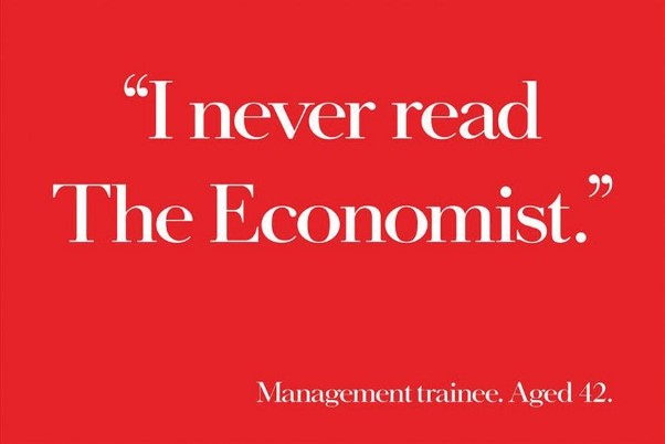
A perfect example (and a personal favourite) is the legendary “White out of Red” campaign developed for the Economist by David Abbot in 1988. This is such a strong campaign and it’s been revisited numerous times since. Brilliantly clever copy, but built on a base of single-mindedness in design and one that has been transferable across mediums, from outdoor billboards to digital banners.
But here is another benefit. All organisations, no matter what size they are, can look like a global brand. None of the elements outlined are hard to adhere to. It’s about discipline, consistency and having the skills to apply them to the next campaign and then the next one. That might not always exist in your team, but it won’t cost the earth to do and the results will deliver the return in next to no time.
If you want to find out how we can make advertising and design work for you get in touch.